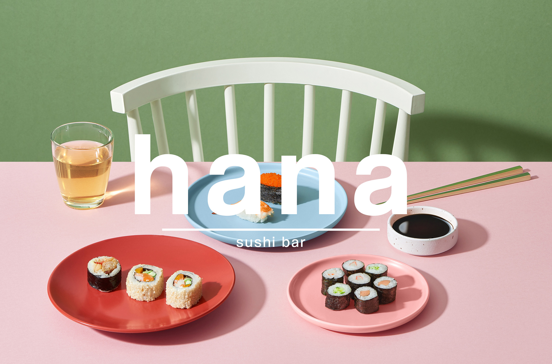
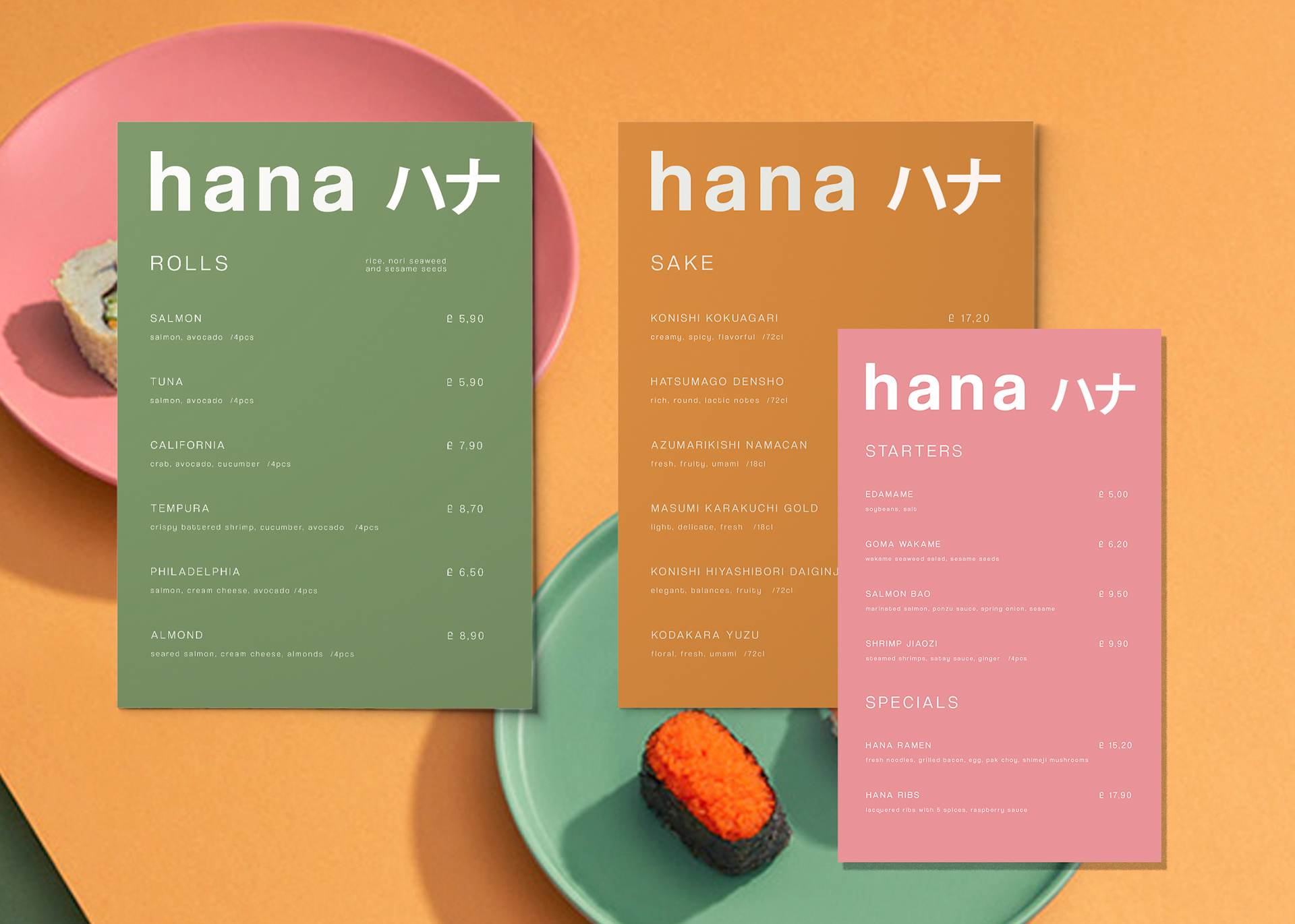
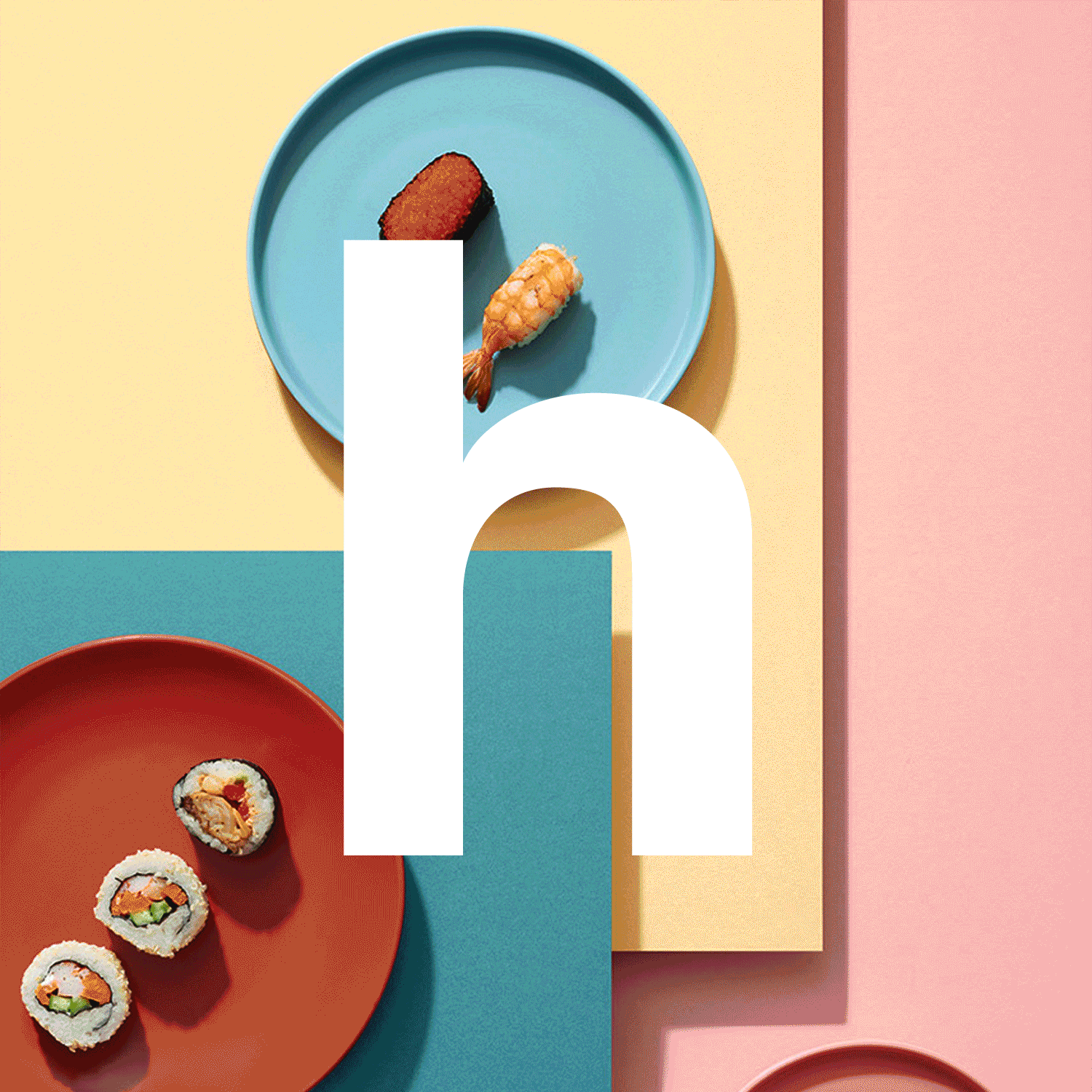
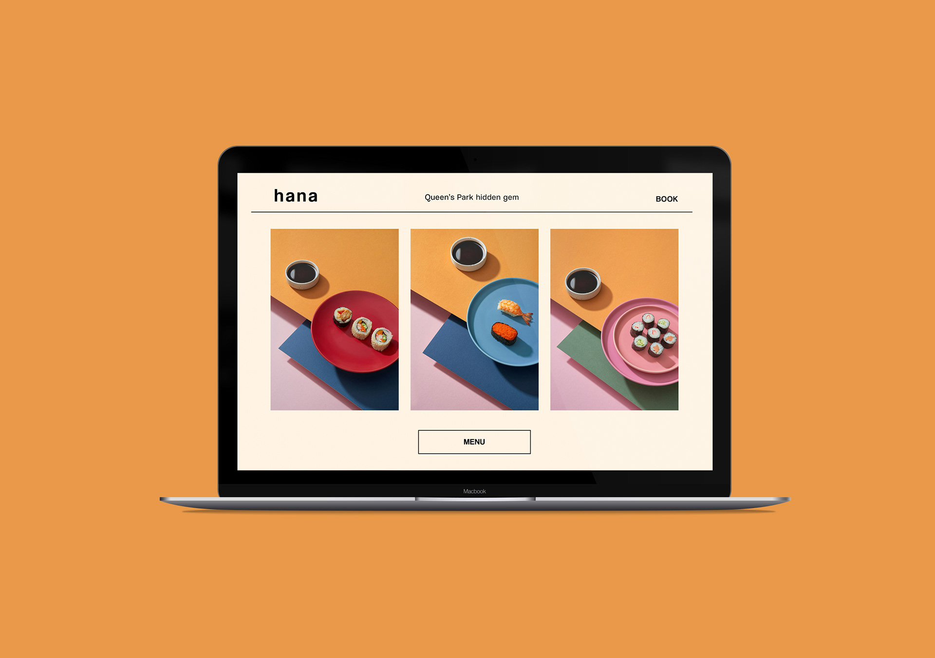
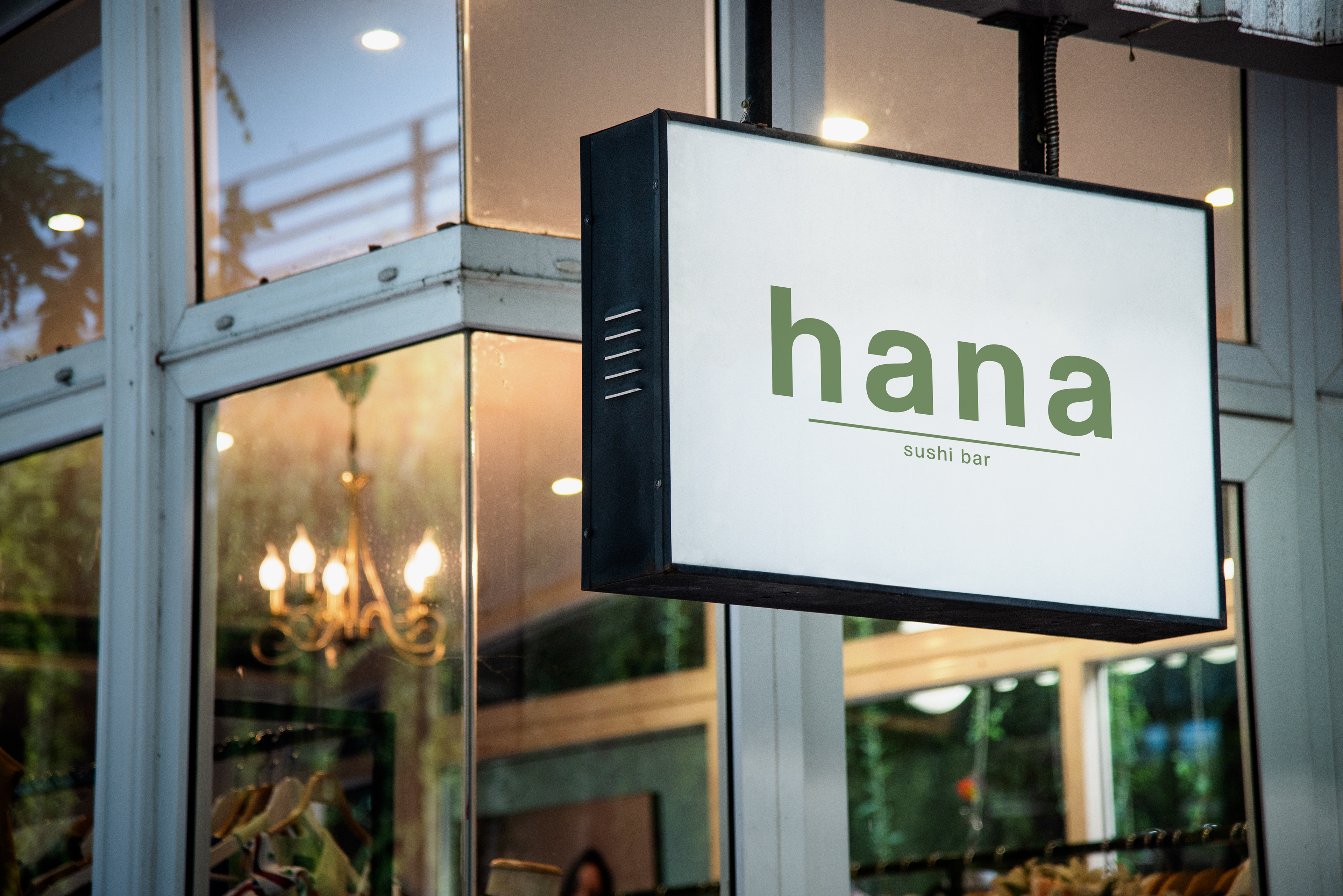
Hana was one of my favorite sushi restaurants in London. However, it didn’t have a proper brand identity other than a logo that didn’t really show the greatness of the food and the experience the restaurant offered.
To solve this problem I decided give them a taste of what their brand identity could be like in order to elevate its look and feel.
Keeping it simple, the aesthetic takes inspiration from the cuisine itself and its colors and sets it apart from other sushi restaurants in the neighborhood.
This is a fictional project.